


assets
Spice up your React projects with these icon libraries that make design fun and easy!
This article was originally published on 14 September 2022, and has been updated on 2 September 2025.
Choosing the right icons is crucial in design - they may be small, but they mean much more than you think. Icons are deemed as visual shortcuts that make user interfaces faster to scan and much easier to understand.
React continues to be a favorite for the front-end landscape and developers are now looking for icons that are optimized for performance, accessibility, and flexibility. Thankfully, React’s ecosystem has many modern libraries that can meet different needs.
So, here’s a roundup of the best icon libraries in 2025 for React that covers community favorites, system staples, accessible React icons, and of course, developer-friendly choices.
When building modern web applications, creating a visually appealing and user-friendly interface is crucial. Icons play a significant role in enhancing the overall user experience by improving navigation, representing actions, and adding visual interest. However, sourcing and implementing icons individually can be time-consuming and inconsistent. This is where React icon libraries come into play.
React icons are collections of pre-designed icons packaged in libraries that are specifically tailored for use in React.js applications. These libraries offer a wide range of icons that can be easily integrated into your React components.

Unicons is an open source, free-to-use icon library designed by IconScout (yep, that’s us!). It provides thousands of icons in SVG or web font formats. These are customizable React icons, and are available in a few different styles: line, monochrome, solid and thin line.
So how do you use Unicons? You can download the React library, import it as CSS, use it as SVG files and as a font file. That’s not all – Unicons is also available on IconScout’s integrations with Adobe XD, Sketch, Figma, and more – so you can use the same set of icons in the design and development stages. Check out this guide to using Unicons for more information.
Features
Installation
yarn add @iconscout/react-uniconsor
npm install --save @iconscout/react-uniconsExample usage
// use individual icons

import React from 'react';
import UilReact from '@iconscout/react-unicons/icons/uil-react'

const App = () => {
  return <UilReact size="140" color="#61DAFB" />
};

export default App;

// or use as a full package

import React from 'react';
import * as Unicons from '@iconscout/react-unicons';

const App = () => {
  return <Unicons.UilReact />
};

export default App;
Font Awesome is a popular icon library, with over 2,000 free and open-source icons. It also offers a pro subscription starting, which gives you access to almost 20,000 icons. These are customizable React icons with different sizes and colors.
Features
Customizable React icons with size and color
Installation
npm i --save @fortawesome/fontawesome-svg-core
npm install --save @fortawesome/free-solid-svg-icons
npm install --save @fortawesome/react-fontawesome
or
yarn add @fortawesome/fontawesome-svg-core
yarn add @fortawesome/free-solid-svg-icons
yarn add @fortawesome/react-fontawesome
Example usage
// import an icon in an individual component

import ReactDOM from 'react-dom'
import { FontAwesomeIcon } from '@fortawesome/react-fontawesome'
import { faCoffee } from '@fortawesome/free-solid-svg-icons'
const element = <FontAwesomeIcon icon={faCoffee} />
ReactDOM.render(element, document.body)

// or import it in your App.js file for global use

import ReactDOM from 'react-dom'
import { library } from '@fortawesome/fontawesome-svg-core'
import { fab } from '@fortawesome/free-brands-svg-icons'
import { faCheckSquare, faCoffee } from '@fortawesome/free-solid-svg-icons'
library.add(fab, faCheckSquare, faCoffee)
Feather icons React library is a collection of minimalist open source icons for React, based on the Feather Icons library. This icon set emphasizes simplicity, consistency and readability.
Features
Installation
npm i react-featheror
yarn add react-featherExample usage
import React from 'react';
import { Camera } from 'react-feather';

const App = () => {
  return <Camera />
};

export default App;
This is one of the most popular UI tools. But what exactly is Material UI? Material UI (or MUI) isn’t just an icon library, but a suite of UI tools to help you design and ship projects fast.
It gives you access to the Material Icons library, which was created by Google in line with the Material Design system. Use them in five different styles: filled (default), outlined, rounded, two-tone, and sharp. With MUI icons react, you can import these Material icons as SVG icons, or use its React wrapper to use custom fonts and SVG icons.
But thanks to its popularity, using Material UI means that your project could look similar to millions of other sites that also use this library.
Features
Installation
If you’re not using Material UI in your project then you can add it with:
npm install @material-ui/coreor
yarn add @material-ui/coreExample usage
import { AccessAlarm, ThreeDRotation } from '@material-ui/icons';

//or

import AccessAlarmIcon from '@material-ui/icons/AccessAlarm';
import ThreeDRotation from '@material-ui/icons/ThreeDRotation';
IconPark gives you access to 2,000 icons in four themes: outline, filled, two-tone or multi-colored. The interesting thing about this library is that it provides an interface for you to customize its icons – so you can see how different features, such as size, stroke width or line cap can affect how the icons look. You can download SVG files from this interface, or simply use it to preview icons as you include them in your React project.
Features
Installation
npm install @icon-park/react --saveExample usage
import {Home} from '@icon-park/react';

// examples
<Home/>
<Home theme="filled"/>
CoreUI is a component library for building admin dashboards. This means that you can use their ready-made components, instead of building them from scratch. It comes with an icon library, which offers 1,500 over free icons.
Features
Installation
// CoreUI Icons library
npm install @coreui/icons

// CIcon component
npm install @coreui/icons-react
or
yarn add @coreui/icons
yarn add @coreui/icons-react
Example usage
import { CIcon } from '@coreui/icons-react';
import { cilList, cilShieldAlt } from '@coreui/icons';

...
<CIcon icon={cilList} size="xl"/>
<CIcon icon={cilShieldAlt} size="xl"/>
...

Iconify refers to itself as a “universal icon framework” as it gives you one syntax for a ton of different open source icon sets. Its icons are rendered as SVG, and can be customized.
Features
Installation
npm install --save-dev @iconify/react
or
yarn add --dev @iconify/reactExample usage
import { Icon } from '@iconify/react';
import home from '@iconify-icons/mdi-light/home';

function renderHomeIcon() {
	return <Icon icon={home} />;
}
Heroicons is a well-known icon library. But even if you haven’t heard of this library, you’ve probably heard of its creators. Heroicons React was created by the same makers of Tailwind, a popular CSS framework. This library offers a small – but beautiful – collection of 292 SVG icons.
Features
Installation
npm install @heroicons/reactExample usage
import { BeakerIcon } from '@heroicons/react/24/solid'

function MyComponent() {
  return (
    <div>
      <BeakerIcon className="h-6 w-6 text-blue-500"/>
      <p>...</p>
    </div>
  )
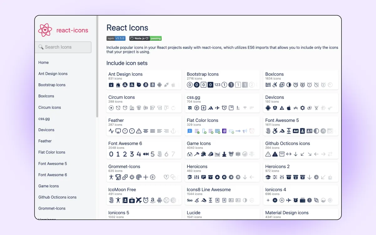
React Icons is a comprehensive library that includes popular icons from various other libraries such as Font Awesome, Material Design, Typicons, and more. This makes it a versatile choice for developers looking to access a wide variety of icons in one place.
Features:
Installation
npm install react-icons
# or
yarn add react-icons
Example usage
import { FaBeer } from 'react-icons/fa';
import { MdAlarm } from 'react-icons/md';

const App = () => (
  <div>
    <h3> Let's have a <FaBeer /> </h3>
    <MdAlarm size={40} color="red" />
  </div>
);

export default App;

Ant Design Icons React library is part of the Ant Design library, which is a popular UI framework for building enterprise-level applications. The icon library includes a wide range of icons that follow the Ant Design style guidelines, making it a great choice for projects using Ant Design components.
Features:
Installation
npm install @ant-design/icons
# or
yarn add @ant-design/icons
Example usage
import { SmileOutlined, HeartOutlined } from '@ant-design/icons';

const App = () => (
  <div>
    <SmileOutlined style={{ fontSize: '24px', color: '#08c' }} />
    <HeartOutlined style={{ fontSize: '24px', color: 'red' }} />
  </div>
);

export default App;

The spiritual successor to Feather, Lucide React offers clean, consistent icons. It houses sharper edges and wider coverage that is lightweight, modern, and gives you full control over size, color, and stroke width through props.
Features
Installation
npm install lucide-reactExample usage
import { Camera, Heart } from "lucide-react";

export default function Example() {
  return (
    <>
      <Camera size={24} />
      <Heart color="crimson" strokeWidth={1.5} />
    </>
  );
}

Designed for adaptability, Phosphor is a flexible icon family where each icon comes in multiple weights. From thin to bold, fill, and duotone, you can switch styles without changing the component.
Features
Installation
npm install @phosphor-icons/reactExample usage
import { Horse, Heart } from "@phosphor-icons/react";

export default () => (
  <>
    <Horse size={28} />
    <Heart weight="fill" color="#e11d48" />
  </>
);

Radix Icons are designed for clarity in dense interfaces. They’re minimal, crisp, and pixel-perfect at small sizes, making them a great fit for dashboards and utility-heavy apps.
Features
Installation
npm install @radix-ui/react-iconsExample usage
import { FaceIcon, SunIcon } from "@radix-ui/react-icons";

export default () => (
  <>
    <FaceIcon />
    <SunIcon />
  </>
);
Bootstrap Icons React library now come as React components, making it easier to drop them into JSX while keeping the familiar Bootstrap aesthetic.
Features
Installation
npm install react-bootstrap-iconsExample usage
import { Alarm, Heart } from "react-bootstrap-icons";

export default () => (
  <>
    <Alarm size={22} />
    <Heart color="tomato" />
  </>
);

Tabler icons React library is one of the largest open-source icon sets, with nearly 6,000 icons. Its clear strokes and consistent design make it ideal for dashboards and product UIs.
Features
Installation
npm install @tabler/icons-reactExample usage
import { IconHome, IconHeart } from "@tabler/icons-react";

export default () => (
  <>
    <IconHome stroke={1.5} />
    <IconHeart color="hotpink" />
  </>
);
The right icon library can help you improve navigation and communication—all while reducing cognitive load. When making your decision on which library to use, ask yourself these questions:
Different libraries can serve different needs. For example, if you’re looking for icons to match an enterprise-grade dashboard, you might want to look at MUI icons (React) or Ant Design icons (React). Meanwhile, Feather, Lucide, or Radix are great for clarity but are also lightweight.
Whichever you choose, these React icon libraries in 2025 will save you hours of design time and help you build your product into a modern, intuitive, and user-friendly one.
Happen to be a designer instead? Check out IconScout’s entire collection of icons – including other design assets like Lottie animation, 3D illustrations and vector illustrations. Better yet, get them on your favorite design tools with IconScout’s plugins for Figma, Adobe Sketch and more.

